
Frank E. Blokland
‘Typography means more than bringing order to the passing on of information;
it implies elevating to the sublime the mould in which the process of passing on is cast.’

Publication from 1983 with mostly analogue type designs from art-academy students in the Netherlands, collected and introduced by Gerrit Noordzij. The large (original size) letters on the cover were made by Frank
Frank (Leiden, 1959) studied Graphic and Typographic design at the Royal Academy of Art (kabk) in The Hague from 1978 until 1983. As a student of the renowned Gerrit Noordzij, he founded the workgroup Letters], of which many nowadays well-known Dutch type designers became members. May 2022, the Type Directors Club (tdc) asked Frank to write a personal in memory of Noordzij for the 43rd edition of their annual report.

Lettering (Cellini capitals) of the Homomonument in Amsterdam (1986)

Design (analog drawings) for sand-blasted lettering of a monument for the city of Leiden (1988)
During that period he worked together with the famous sculptor Frans de Wit on a number of monuments for the city of Leiden.
Logo designed and cut in granite (around 1990)
Also around that time Frank started to cut letters in stone.

Gravestone designed and cut by Frank (1996)

Calligraphy, the Art of Writing
Frank wrote the book for the television course Calligraphy, the Art of Writing in 1990; 16.000 copies of this book went over the counter. Further since the 1980s he has written some 150 articles on type design and font production for various graphic and design magazines, like Compres, Pers, PrintBuyer, Hamburger Satzspiegel and Page.
")
Masthead for magazine (around 1990)

Masthead for magazine (1993)

Masthead for magazine (1994)
Vendex_kbb logo by Frank and HV&P
During the 1990s Frank worked closely together with the design agency Hazelhoff de Vaal & partners on a number of logo’s and mastheads.

Modifications generated with DrawMonkey

Proprietary screen font for ‘bbc Electron’ home computer (1983)
After years of preparation, in 1990 Frank founded the Dutch Type Library, the first and nowadays largest producer and publisher of digital typefaces in the Netherlands.
![]()

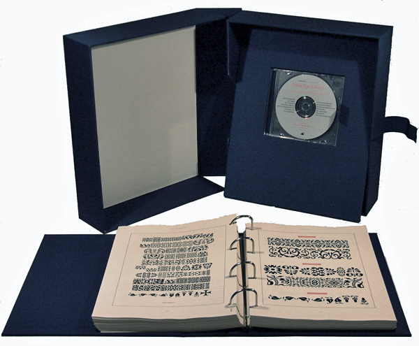
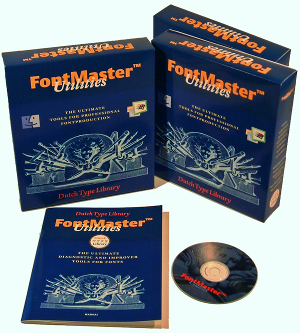
A couple of years later he initiated and supervised the development of dtl FontMaster, a set of utilities for professional font production developed by dtl and the Hamburg, Germany, based company urw.

dtl BezierMaster, one of the modules of the dtl FontMaster suite
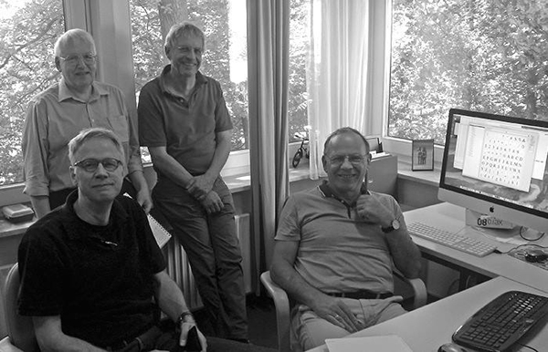
dtl FontMaster development team at urw in Hamburg, summer 2017
FoundryMaster is the latest successor of dtl FontMaster

The regular and bold n’s of the original manually bitmapped version of dtl Documenta (1986)
Frank has designed typefaces like dtl Documenta, dtl Documenta Sans, dtl Haarlemmer (on the basis of drawings by Jan van Krimpen), dtl Haarlemmer Sans and dtl Romulus (also based on drawings by Jan van Krimpen).

dtl Documenta was the corporate typeface of the Rijksmuseum
For roughly a decade the seriffed and sans versions of dtl Documenta formed the corporate identity typefaces of the famous Rijksmuseum in Amsterdam, the Netherlands. The typeface was used for the signage in- and outside the museum, publications, annual reports, etc.

dtl Documenta applied in Gotteslob
dtl Documenta has been applied in Gotteslob, the new prayer and song book of the Catholic church in Germany and Austria.The production of the 3.6 million copies (1,300 pages each) required eight tons of red ink and roughly 3,000 tons of light-weight paper (40 grams).
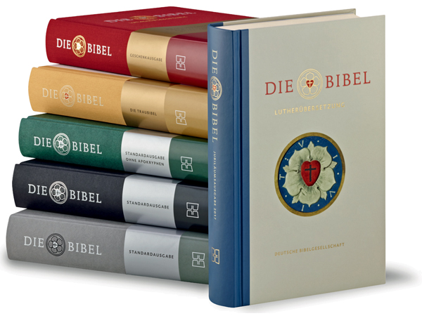
260,000 copies of the Luther Bibel 2017, typeset in dtl Documenta, were printed for the Evangelische Kirche in Germany end of October 2016.

dtl Haarlemmer is used for the street signs of the city of Haarlem
Since 2010 new street signs are placed in the city of Haarlem for which dtl Haarlemmer is used. The design agency Bureau Arjan Karssen selected the seriffed version for the street signs in the historic city centre, and the accompanying sans serif is used on two different signs for the pre- and post World War ii parts of the city.

Drawings for the Bacchus typeface (1986–1990)

First dtl Fell pencil drawing with IKARUS markings by Frank (1997)

Analog drawings of accompanying roman (named Orfeo) for the Cellini capitals (1987)
When Gerrit Noordzij retired in 1987 from the Royal Academy of Art (kabk) in The Hague, Frank was the first of the younger generation to succeed him. As Senior Lecturer Frank now teaches writing, letter drawing, and type design/font production to the graduate and post-graduate courses at the Graphic Design department.

Lecturing first year students of Graphic Design department at the kabk (2008)
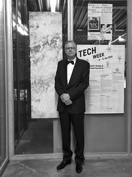
Just before the reception (and in front of the poster announcing it) to celebrate 30 years of lecturing at the kabk’s Graphic Design department on 19 December 2017.
In 1995 he was asked to become professor at the Plantin Society in Antwerp.
Frank teaching at the Plantin Institute of Typography
Further he has lectured as a guest professor at institutes like the Technical University of Delft, the University of Reading, and Lahti Polytechnic University.
Jan van Krimpen’s 1950’s logo for the Plantin Society, digitized and redesigned by Frank in 2011
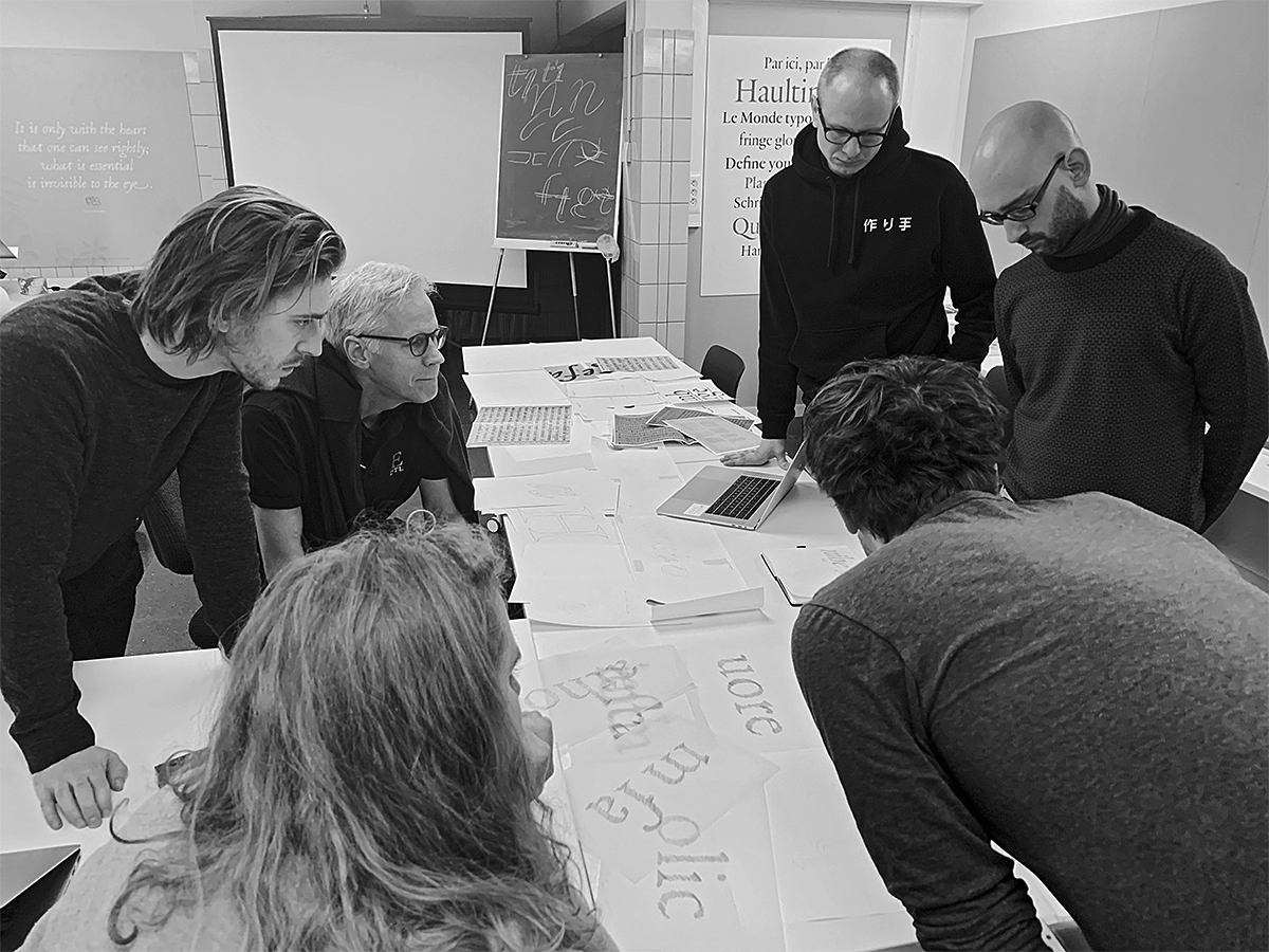
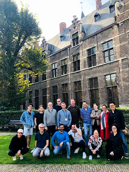
Since 2019 Frank is co-organizer and author of the program of the annual Typography Summer School at the University of Antwerp, which takes place under the umbrella of the university and the Plantin’s Institute of Typography.
Typography Summer School Antwerp class 2019
In 2004–2011 Frank designed the lettering for the newly restored stained glass windows of the St. Peter’s Church in Leiden, the Netherlands. On YouTube a short film (Dutch spoken) shows the restoration of the church, and the design and production of the lettering.

Stained glass lettering for St. Peter’s Church, Leiden
April 2013 Frank designed the calligraphic lettering of H.M. Queen Beatrix’s Abdication Act. The letters on the act, in Humanistic Minuscule and Italic hands, with all their contextual letter-variants, were written by Frank and transferred by himself into two digital fonts: Abdicatie Regular and Abdicatie Italic using the dtl FontMaster tools. The text was subsequently silkscreened on parchment.

Silkscreened calligraphic lettering on the Abdication Act 2013

The Adication Act 2013 Team. fltr: Henk Reuter, Trudie Demoed, Jaap Drupsteen,
and Frank
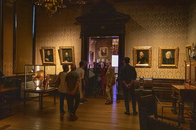
Summer 2016, as guest curator Frank arranged the display of Renaissance type-foundry material (in relation to digital font technology) at the historical type foundry of the Museum Plantin-Moretus. He did this together with Kris Geysen, who is curator of printed material at the museum.

Frank organizing the display of historic type-foundry material at Museum Plantin-Moretus
On 11 October 2016 at 11:15 a.m. Frank successfully defended his PhD dissertation at Leiden University. Frank’s research is conducted to test the hypothesis that Gutenberg and consorts developed a standardized and even unitized system for the production of textura type, and that this system was extrapolated for the production of roman type in Renaissance Italy.
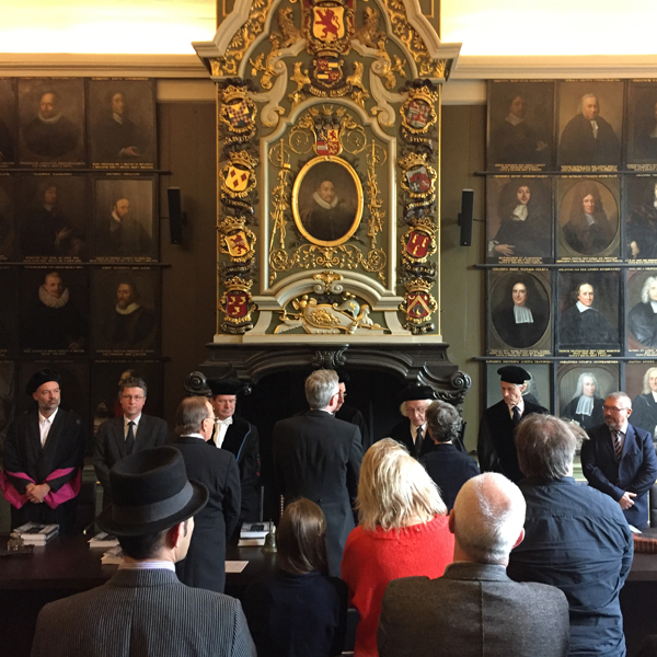
Frank’s PhD defence ceremony in the Senate Room of the Academy Building
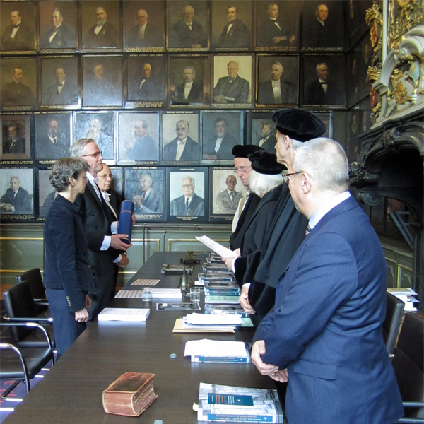
Dr. Blokland in front of the Opposition Committee after receiving his diploma
Outcomes of this research have been translated a set of Python extensions for Glyphs and RoboFont, named ls Cadencer and ls Cadenculator, developed by type designer Lukas Schneider in cooperation with Frank. These tools can be used for (batch) auto spacing and analysis, which is based on the intrinsic underlying patterning in roman and italic type. This software can be used to replace optical spacing completely or it can be applied supplementally to spacing by eye.
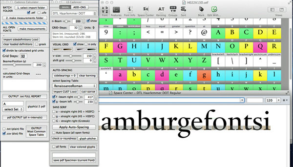
ls Cadencer and ls Cadenculator jointly developed by Lukas and Frank
May 2018 the University of Split, Croatia, published Osnove oblikovanja pisma, a book on type-design fundamentals by Dr. Nikola Djurek and Frank. On the one hand it combines elements of Frank’s calligraphy course book from 1990 with his more recent research into the origins of the harmonics, patterns and dynamics in movable Latin type. On the other hand it contains information from Nikola’s PhD dissertation on the history of and conventions for Croatian diacritics with his ongoing research on the history of Croatian scripts (Glagolitic, Cyrillic, Latin).
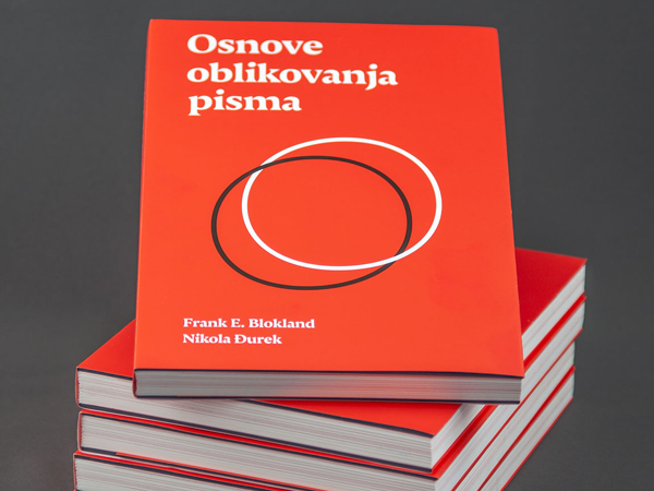
Osnove oblikovanja pisma (‘Type-design fundamentals’)
Early July 2019 Wim Crouwel received the Type Directors Club (tdc) Medal 2019 from Frank at the award-winner’s studio in Amsterdam. This informal ceremony was recorded and shown at tdc’s annual awards presentation at The Rose Auditorium of The Cooper Union in New York City on July 17.
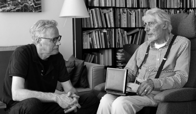
tdc Medal 2019 presented to Wim Crouwel
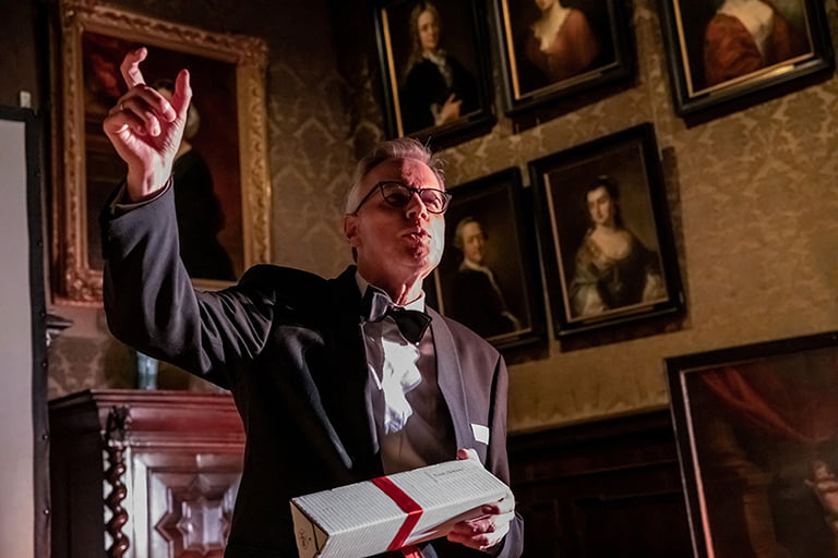
On Saturday evening 25 June 2022, the 70th anniversary of the Plantin Society | Plantin Institute of Typography was celebrated in the breathtaking historical setting of Museum Plantin-Moretus in Antwerp. During the atmospheric event, Blokland received a Laureate Honoris Causa in recognition of his important achievements in the field of typography in Flanders.
The celebration took place in the museum’s large salons
Short word of thanks to emphasize that working with students is a real privilege