
Program
•Introduction
In the LetterStudio second and third year students of the kabk can follow courses (modules) about letters in the broadest sense of the word. This includes, but is not limited to, writing, type design, font production, font technology (including coding), and everything else that is, or could be part of the professions of the graphic designer, calligrapher, lettering artist, type designer, and font producer. The spectrum offered is determined by the teachers and students, and the scope is not limited to the current developments in the professional field: future developments are also anticipated (after all, you will even determine these in due course).
•Modules
Students must enroll in modules that cover the areas they wish to explore. The duration of a module is about twelve sessions and two modules must be taken in one block (half a semester). It is mandatory to select modules that are different or even contradictory, i.e., represent opposing points of view and differing approaches. Selections must be substantiated and decisions made in consultation with the teachers.
The degree of difficulty of the listed modules differs: in some cases, a module must be completed before moving on to the next level. The modules are in principle determined by the teachers, but in exceptional cases custom modules can be set up by the students –in consultation with the teachers, of course.
•Evaluations
A mid-term assessment takes place halfway through the semester. You then give a pitch presentation for the entire group about the process and the progress of your studies. You do this digitally by using the large screen in the classroom and/or analog, for example by showing sheets with written and drawn letters. The idea is that you give an overview of your studies so far, elaborate on the result and what your goal is, and explain how you intend to proceed.
Individual assessments take place at the end of the semester. You have to present your study results to your teachers individually (so not for the group as in the mid-term evaluation). You will find the learning outcomes in the module descriptions. You should also write a short self-assessment (just a few lines) prior to the assessments. It should include information about your expectations, experiences, process, and progress, plus a reflection on the final results.
The modules below are arranged by supervising teacher (in alphabetical order).
A list of the 2025–2026 course modules is available for download in pdf format.
•Frank E. Blokland

Formalized Humanistic minuscule written with flat brush.
FB_1. The LeMo Method: Type Design Patterns (level 1)
There is not much debate about the fact that written letters were initially standardized and eventually formalized by the Renaissance invention of movable type. Consequently, writing with a broad nib can be a good starting point for exploring aspects such as construction, contrast sort, contrast flow, and contrast. However, one could argue that writing and the rectangle-based movable-type paradigm –whether analog or digital– are two essentially different things. After all, the calligrapher creates a harmonious and rhythmic pattern and will never be concerned with the question of where a character’s space begins or ends. There are no rectangles marking the boundaries of space in calligraphy.
Nowadays, the starting point in type-design education is usually morphology. The emphasis is on the shapes of letters and especially on the contrast principles. However, if one takes into account that the type designer creates character patterns and then breaks them down into a collection of movable rectangles for typesetting, one could also look at the matter from a different perspective, namely by emphasizing pattern formation and basically morphology and contrast principles on the second place. This approach is typical of the LeMo Method, which always starts from a pattern based on (Renaissance) frameworks, which in turn are the result of an intrinsic standardization of the underlying written models. The associated dtl LetterModeller application is based on and uses these frameworks.
This video gives a short impression and introduces an extensive instruction version.
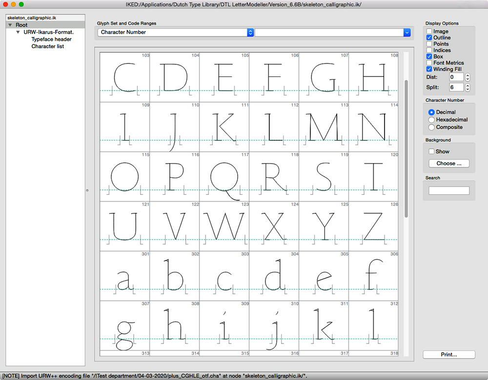
‘Skeleton’ font for the LetterModeller application.
Objective and goals
The emphasis is on the practical part, in particular creating a digital roman-type model.
The module is intended to gain a better understanding of:
– the principles of type design, such as the intrinsic relationship between letterforms and patterns,
– the intrinsic standardization and systematization in historically written models,
– the relationship between type and historically written models,
and to acquire (more) technical skills in font editing.
End terms
– Presentation: an overview of the development of your font plus two A2 presentation panels.
– Evaluation criteria: the depth of the study, the insight into the subject matter, the quality of the model produced.
Foundational hand translated into roman type using the LeMo Method.
Download LeMo version 7 (free) for macOS (17.7 mb)
Download LeMo version 7 (free) for Windows 64-/32-bit (32.4 mb)
Download LeMo version 7 (free) for Linux (25.1 mb)
FB_2. Investigating Micro Typography (level 1)
Terms like ‘macro typography’ and ‘micro typography’ have become popular these days, but in essence they are simply synonyms for typesetting and typography respectively. All contemporary graphic designers are ‘macro typographers’. However, how many of them will be able to answer questions such as what exactly forms the basis for pattern formation in letters, or the related question of what is the origin of typographical conventions? Digital typography is becoming increasingly sophisticated: for example, OpenType Layout features can automatically adjust many detailed things, such as ligature substitutions, contextual alternates, figure sets, and invoking small caps. Assessing digital outcomes, however, requires an in-depth understanding of what typography entails.
This module aims to explore and study the æsthetic, conceptual, and ergonomic aspects of typography. This is done with the technical consequences of related decisions in mind, for example the use of grep and/or scripting. Moreover, not only optical and technical aspects are examined, but also the (historical) origin of the typeface used, the type designer cum punchcutter in question, and the style period in which a revival was originally created, if applicable.
In addition, the application of artificial intelligence in the typographic process is being investigated. After all, it is inevitable that the role of ai will become increasingly important. For example, it is not excluded that in the near future ChatGPT may be able to generate InDesign code after receiving instructions along with text and images. This raises all kinds of questions: from how you deal with this as a graphic designer, to implications for copyright when text and images are uploaded.
Objective and goals
You will have to choose between designing a book, a magazine, or a (series of) posters. The project should allow you to explore as many typographical challenges as possible. Moreover, all students who follow the micro-typography module together, make a booklet in which they collect their studies and conclusions. The idea is that this publication can then be used by other students to increase their insight into typography.
The module is intended to gain a better understanding of:
– the underlying forces of typographical conventions,
– the relationship between conceptual and ergonomic decisions,
– the application of technical matters, for example OpenType features,
to acquire practical skills, and to invoke automation in Adobe InDesign via grep, scripting, and artificial intelligence.
End terms
– Presentation: a book, a magazine, or a (series of) posters and a handful of pages on the process and progress of the research intended for the aforementioned joined publication.
– Evaluation criteria: depth of the study, the originality and quality of the typographical solutions, and the insight gained into the subject matter.
FB_3. Revival of a Renaissance Type Model (level 1)
By highlighting the historical and technological boundaries of the punchcutter’s profession and practice, and by encouraging critical and analytical thinking, graphic-design students should be able to gain a deeper understanding of the historical development of the typographic métier. Research, whether scientifically based and/or empirically oriented, will generate knowledge about the origins of type-design frameworks and typographic conventions and will undoubtedly teach one more than one would learn from merely optically reproducing historical letterforms.
For this module, a revival of a type model from the Italian or French Renaissance must be developed. Recent insight into Renaissance production methods, as presented on this blog, proves that the standardization of roman type arose at least in part from technical constraints that structured the handwritten pattern and directly affected the details and proportions of letters. This module allows you to explore archetypal Renaissance patterns. Additionally, you will explore auto-tracing tools and the application of related artificial spacing of digital type using specialized tools. The basis for your revival is formed by photographs of original fifteenth- or sixteenth-century prints that you must make in the collection of the National Library of the Netherlands (kb) in The Hague.
Objective and goals
The emphasis is on the practical part, namely developing a revival. A relatively short essay about your research, i.e., the process, progress, and outcome, should be written.
The module is intended to gain a better understanding of:
– the principles of the movable-type paradigm,
– Renaissance punchcutters and their idioms,
– technical constraints of the Renaissance type-production processes,
– the basis of typographical conventions.
and to acquire more extensive skills in digital type design and font production.
End terms
– Presentation: a type specimen showing the revival, and the aforementioned essay. The essence of the research must also be presented on two A2-sized panels.
– Evaluation criteria: depth of the study, the originality and quality of the revival, and the insight gained into the subject matter.
FB_4. Defining a Grapheme System (level 2)
The comparison of the sets of graphic symbols used to represent scripts will inevitably lead to the conclusion that the rules of harmony and rhythm can be very different. One could argue that when such a ‘grapheme system’ is set up, its further development (evolution) and therefore the associated conditioning is determined by the applied structures themselves. In other words, the rules are purely relative to the system.
This module involves the development of a completely new grapheme system for the Latin script. Would it be possible for you to ignore or circumvent existing typographical conventions and associated preferences for harmony and rhythm when defining a new grapheme system and related rules? Be aware of the fact that developing a new grapheme is a lot of fun, but it is also complex matter, which is why this is a second-level module. You will have to come up with convincing arguments that you are capable of handling this kind of thing.
Objective and goals
The emphasis is on both the practical and theoretical parts; the research results in a newly developed grapheme system and in a relatively short essay in which the development is explained and illustrated.
The module is intended to gain a better understanding of:
– the foundation and principles of typographical conventions,
– rules for harmony and rhythm (in existing scripts),
– evolution of (letter)forms,
and furthermore, to acquire more extensive skills in type design and production.
End terms
– Presentation: a type specimen (on paper or digital/animated) showing/explaining the grapheme system and a brief essay in which you describe and illustrate your research. The essence of the research must also be presented on two A2-sized panels in such a way that it is easily understood by third parties.
– Evaluation criteria: depth of the study, the originality of the solutions, the insight developed.
•Marina Chaccur
MC_1. Modular Type System (level 1)
The goal of this module is to develop a systematic approach to design a cohesive display typeface, composed by a collection of shapes. The individual parts may be moved, rotated, and overlap each other to build recognisable letterforms, but if they are scaled or mirrored, they become new elements. There is no fixed amount of shapes, as long as they get reused through the character set, and it is not limited to modules that will compose a ‘pixel’ font.
Outcome
– A full alphabet (upper or lowercase) and some basic punctuation (period and comma, for instance).
End terms / Deliverables:
– Specimen: Sample(s) of the designed project in use. It can take any shape, material and dimension that is more appropriate to showcase the outcome.
– Documented Process: a designed piece (booklet, poster, website,…) containing all the relevant information regarding the project, and highlights of the process, from start to finish.
MC_2. Typographic Decoration (level 1)
Typefaces can also contain pictograms and ornaments to help inform and / or decorate layouts. Alternatively, it is possible to design an independent typeface containing only such glyphs, which can be paired with a variety of type styles. This module is focused on the systematic creation of ornaments, designed to be used on their own as well as borders and patterns, in a wide range of applications, focusing on consistency through elements other than letterforms, and how to work with these extra characters in a typographic setting/ structure.
Outcome
– A typeface containing a set of typographic ornaments.
End terms / Deliverables:
– Specimen: Sample(s) of the designed project in use. It can take any shape, material and dimension that is more appropriate to showcase the outcome.
– Documented Process: a designed piece (booklet, poster, website,…) containing all the relevant information regarding the project, and highlights of the process, from start to finish.
MC_3. Letters in Context (level 1)
Typefaces are often designed with a specific purpose in mind, very much like letterings, they need to consider where they will be applied, the size and distance it is going to be read, to which audience it is communicating, what kind of messages, and so on. So in this module, the focus is to shape letterforms according to the context to which they are being designed for. The emphasis is also on materiality, and the necessary adjustments and adaptations of the shapes for a good fit for purpose.
Outcome
– A typeface or lettering piece(s) appropriate for the intended use.
End terms / Deliverables:
– Specimen: Sample(s) of the designed project in use. It can take any shape, material and dimension that is more appropriate to showcase the outcome.
– Documented Process: a designed piece (booklet, poster, website,…) containing all the relevant information regarding the project, and highlights of the process, from start to finish.
•Peter Verheul
Creating a shared experience inside and outside LetterStudio class:
It is useful to share your ideas and insights with other students. Especially the ones who have chosen the same module as you have. This can be done in consultation during the different LetterStudio lessons. Find a way to create a platform included the fellow module members of the other group as well. It is allowed to work on a font/project together with a fellow module member. LetterStudio is for an important part about learning together.
Digitizing process should be experienced and shared with, at least, one fellow LetterStudio student. Sharing the workload of creating digital fonts, which contain the vital desired glyph set. Exchange your findings and create a working relationship to learn from each other.
For example: Module 1 Contrast collaboration structure. Three different weights should be produced. Divide the workload together with two other students who picked the same module. Each of students in this group is finishing one of the three desired levels of contrast in digital format: 1. Regular contrast, 2. High contrast, 3. Low contrast.
PV_1. Contrast research (level 1)
This module makes you familiar with the domain of the contrast sort ‹translation› and different amounts of contrast. Physically drawing type will be an important aspect of practice initially as well as digitizing later on. Starting to write with the flat brush, following the model of the Humanistic minuscule, you define the basic shapes and constructions of letter shapes. These shapes have to be transposed into three different contrast variations. Normal, high, and low contrast. This exercise will give you quite some vital insight in the process of type design and understanding of proportion, spacing, weight, construction and contrast in letterforms.
Required glyph set: OHamburgefonstiv., and not to forget the (word)space glyph to be able to set text.
End terms
– Presentation: present the words at text sizes, together with sample texts using the different characters (glyphs). Make a process book with clear explanations/comments and critical remarks.
– Evaluation criteria: understanding the difference in contrasts: High to low. Translation to expansion. Practice drawing. From manual to digital. Being able to make relevant design decisions which lead to greater functionally. Define relevant typographic criteria based on the defined and designed typographic system. Planning the process.
PV_2. Display type; type for headlines, posters, signs or buildings (level 1)
What makes a type design for larger sizes different from a design for body text? Text typefaces are designed to set and read text at small sizes mainly to be read at arm length distance. Coherence in letter-, line and word spacing to form legible text. Together with equality in hight of contrast and proportion, similar abstraction level of individual letters form a basis for type for body text. Type for text books, magazines, websites, etc.
Design a typeface with a specific voice/style for larger sizes. Experiment with writing and drawing tools and construction styles in different sizes. But also vary the parameters for weight, slant and width. Explore the relation between size and detail to get to the desired level of abstraction in the letter shapes and its typographic structure/pattern. Stylistically, type can differ in many ways, from modestly formal to exuberantly expressive (informal). The letters need to be digitized for several types of typographical designs which are showing the typeface perform on the fitting areas of application. From large to the smallest size wherein the typeface keeps its adequate legibility.
The range of required glyphs: capital letters, lowercase and punctuation marks. A useful secondary set could contain for instance figures and perhaps some ornamental elements.
End terms
– Process book and type specimen. Presentation: make an overview of your research path together with a type specimen explaining the process of design from begin to end with critical remarks. Present the functionality and usability of the typeface at the required size(s) and the exact materializations.
– Evaluation criteria: understanding the specified limitations in dynamics for the individual shapes of the letters in relation to each other and the whole. Show the ability to vary in stylistic diversities. From expressive to more modest approach. Being able to make relevant design decisions which lead to greater functionality. Practice drawing. From manual to digital. Define relevant typographic criteria based on the defined and designed typographic system. Ability to (re-) create in digital domain, by handling software to manipulate contour descriptions of letterforms. And last but not least: planning the process.
PV_3. Type design, free of choice (level 2)
This module is for students who already have spent another semester in LetterStudio. In consultation you can work on your own typeface. This could start with a description of the desired use and application. How could these requirements be of influence to the style and shape of your letters? Define shapes by using parameters like: contrast (sort and amount), construction, proportion, weight, width, slant. And experiment with contrasting characterizations for instance: rigid vs. flexible or abstract vs. detailed. Make a series of TypeCooker-drawings to exercise your drawing and sketching skills.
The range of required glyphs are: capitals, lowercase, figures, and punctuation marks, etc. Possibly with additional glyphs/weights/variations depending on the requested use/performance. The result should be a digital font.
End terms
– Presentation: make an overview of your research path together with a type specimen explaining the process of design from begin to end with critical remarks. Present the functionality and usability of the typeface at the required size(s) and the exact materializations.
– Understanding the limitations and possibilities in dynamics for specifying the individual shapes of the letters in relation to each other and the whole. Show the ability to vary in possible stylistic diversities. Practice drawing. From manual to digital. Being able to make relevant design decisions which lead to greater functionally. Define relevant typographic criteria based on the defined and designed typographic system. Planning the process.
Tips, advise, and suggestions in random order:
– Read the module descriptions carefully regularly. So you know what to do and what is expected (end terms).
– When designing letters always judge them in a word shape, definitely not in alphabetical order. Preferably in the context of the desired application. (Simplicity can create difficult optical results: designing a low contrast sans serif is more difficult than you might think.)
– Do not be distracted and too much influenced by examples, but focus on your own results. Examples are mainly there to convince you that the possibilities are endless.
– Be there every lesson, even if the results are disappointing.
– Don’t be scared of making mistakes. Those are necessary to make to progress. Learning comes from failure and self correction.
– Sketch at least a new and different styled letter a day in your dummy. Experiment.
– Make use of the workshops at the kabk. Lasercutting, printing, etc. N.B. Make appointments on time.
– When in doubt draw.
– To exercise your drawing/sketching skills make a series of TypeCooker-drawings. More information can be found in this article.
– Broaden you horizon on type & typography by visiting the kabk library and institutions outside:
Museum Meermanno, kb (National Library of the Netherlands), UvA Special Collections in Allard Pierson.