
Program
•Introduction
In the LetterStudio second and third year students of the kabk can follow courses (modules) about letters in the broadest sense of the word. This includes, but is not limited to, writing, type design, font production, font technology (including coding), and everything else that is, or could be part of the professions of the graphic designer, calligrapher, lettering artist, type designer, and font producer. The spectrum offered is determined by the teachers and students, and the scope is not limited to the current developments in the professional field: future developments are also anticipated (after all, you will even determine these in due course).
•Modules
Students must enroll in modules that cover the areas they wish to explore. The duration of a module is about twelve sessions and two modules must be taken in one block (half a semester). It is mandatory to select modules that are different or even contradictory, i.e., represent opposing points of view and differing approaches. Selections must be substantiated and decisions made in consultation with the teachers.
The degree of difficulty of the listed modules differs: in some cases, a module must be completed before moving on to the next level. The modules are in principle determined by the teachers, but in exceptional cases custom modules can be set up by the students –in consultation with the teachers, of course.
•Evaluations
A mid-term assessment takes place halfway through the semester. You then give a pitch presentation for the entire group about the process and the progress of your studies. You do this digitally by using the large screen in the classroom and/or analog, for example by showing sheets with written and drawn letters. The idea is that you give an overview of your studies so far, elaborate on the result and what your goal is, and explain how you intend to proceed.
Individual assessments take place at the end of the semester. You have to present your study results to your teachers individually (so not for the group as in the mid-term evaluation). You will find the learning outcomes in the module descriptions. You should also write a short self-assessment (just a few lines) prior to the assessments. It should include information about your expectations, experiences, process, and progress, plus a reflection on the final results.
The modules below are arranged by supervising teacher (in alphabetical order).
A list of the 2021–2022 course modules is available for download in pdf format.
•Frank E. Blokland (concise bio)

Formalized Humanistic minuscule written with flat brush.
FB_1. From writing to type: the LeMo Method (level 1)
Writing with a broad nib is a good starting point for examining things like construction, contrast sort, contrast flow, and contrast. However, translating handwriting into type is not a very straightforward process. Even for me as experienced calligrapher (I set up a calligraphy course for the Dutch television and wrote a book for it end of the 1980s).
There is not much discussion about the fact that written letters were initially standardized and eventually formalized by the Renaissance invention of movable type. However, there is no known Humanistic handwriting predating movable type that shows such a clear standardization as roman type. From my measurements of Renaissance prints, punches, matrices, and foundry type –as part of my PhD research at Leiden University– I conclude that standardizing and systematizing matters as character widths were prerequisites for the Renaissance type production. Proportions and details of letters were adapted to this standardization and systematization. The LeMo method and the associated dtl LetterModeller application are based on and use this framework.
This video gives a short impression and introduces an extensive instruction video.
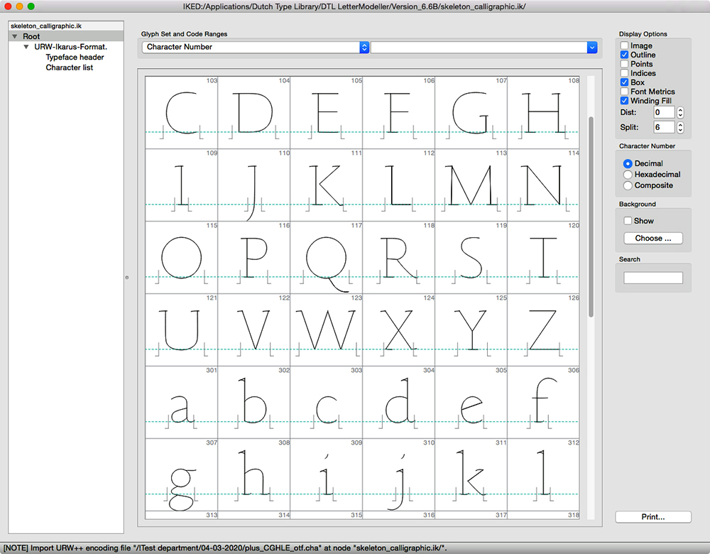
‘Skeleton’ font for the LetterModeller application.
In this module you will translate the Foundational hand (a formalized Humanistic minuscule) that you practiced with a broad nib in the first year into a digital typeface using the most recent scientific insight that is translated into the LeMo Method. Even if you are not a very good calligrapher you will still manage to produce a solidly rhythmically patterned type design. And it provides you with a good reason to improve your hand!
End terms
The emphasis is on the practical part, specifically the translation of handwriting into type.
– Presentation: an overview of the development of your typeface plus three A2-sized presentation panels.
– Evaluation criteria: the depth of the study, the insight in the matter, the quality of the produced type, and additionally for bonus points: the refinement of the developed hand.
Foundational hand translated into roman type using the LeMo Method.
Download LeMo version 6.9 for macOS (16.7 mb)
Download LeMo version 6.9 for Windows 64-bit (17.6 mb)
Download LeMo version 6.9 for Windows 32-bit (16.2 mb)
Download LeMo version 6.9 for Linux (23.9 mb)
FB_2. Investigating micro-typography (level 1)
The rise of desktop publishing in the second half of the 1980s changed the graphic landscape completely. Within a decade the highly specialized métiers of the typesetter and typographer were merged in that of the computerized graphic designer, irrespective of whether macOS, Windows, or Linux is used. Together with the operating systems come an increasing number of fonts and everyone is by definition a typesetter nowadays. However, not everyone is a typographer, because this requires specialist knowledge and insight. New terms as ‘macro-’ and ‘micro-typography’ have become popular nowadays, but they are only synonyms for typesetting and typography respectively.
All present-day graphic designers are ‘macro-typographers’ but not many will be able to provide the answer to questions like what exactly forms the basis for the patterning in type, or the related question regarding what is the origin of typographic conventions. Digital typefaces are becoming more and more sophisticated: OpenType Layout features can automatically adjust all kind of detailed matters, such as ligature substitutions, the application of contextual alternates, related positioning of diacritics, et cetera. For this, in the past the typographer had to write detailed instructions for the typesetter. However, to be able to judge the digital outcomes, a deep understanding of what exactly typography comprises, is necessary.
This module is meant the explore and study the details of typography in a time in which the emphasis seems to be more on concept than on exquisite refinement. Not only technical and optical aspects will be investigated, but also the (historical) origin of the typeface used, the type designer in question, and the style period in which the typeface was made. You will have to define your goal, which could be a book, a (series of) posters, or a website, et cetera, as long as it will be possible to apply highly detailed typography.
End terms
The emphasis is on the practical part, which is the design of a book or leaflet(s) or a series of posters, et cetera. A brief (and well-designed) report on your research has to be produced.
– Presentation: a book or leaflet(s), or a series of posters, et cetera, and the report. Also the essence of the study has to be presented on three A2-sized panels.
– Evaluation criteria: depth of the study, the originality and quality of the font, and the gained insight into the matter.
FB_3. Revival of a historic Renaissance typeface (level 1)
For this module a revival has to be developed of a typeface from the Italian or French Renaissance. For this recent insight in Renaissance production methods, as presented on this blog, is used. The standardization of roman type structured the handwritten pattern and directly influenced details and proportions of letters. All of you have been conditioned by these letters and are capable of optically reproducing and judging the patterns. Hence, you could conclude that the origin of the patterns is purely an optical one. From my PhD research at Leiden University I conclude that matters are more complex.
This module will let you explore archetypal Renaissance patterning and the application of related artificial spacing of digital type using specialist software. Also you will investigate tools for auto-tracing and generating fonts. This way you will gain more insight into the basics of typographic conventions. The basis for your revival is formed by your pictures from original sixteenth-century prints in the collection of the National Library of the Netherlands (kb) in The Hague.
End terms
The emphasis is on the practical part, which is the development of a revival. A relatively brief (and well-designed) essay on your research and the outcome has to be written.
– Presentation: a type specimen showing the revival, and the report. Also the essence of the study has to be presented on three A2-sized panels.
– Evaluation criteria: depth of the study, the originality and quality of the font, and the gained insight into the matter.
FB_4. Defining a grapheme system (level 2)
The collections of graphic symbols used for representing scripts are quite arbitrary. As soon as such a ‘grapheme system’ is set up, the further development (evolution) and consequently the related conditioning is defined by the applied structures themselves. What is considered to be optically correct is only purely relative to (the conventions of) the grapheme system. This module comprises the development of a complete new grapheme system for the Latin script. Would it be possible for you to ignore or circumvent current conventions when defining a new grapheme system and related typographic rules (conventions)?
Developing a new grapheme is great fun but it is also complex matter, hence this is a second-level module. You will have to convince me that you are capable of handling this stuff!
End terms
The emphasis is on both the practical and theoretical part; the study results in a newly developed grapheme system and in a relatively brief (and well-designed) essay, in which the development is explained and illustrated.
– Presentation: a type specimen (on paper or digitally/animated) showing the grapheme suystem and an essay. Also the essence of the study has to be presented on three A2-sized panels.
– Evaluation criteria: depth of the study, the originality of the solutions, the developed insight.
•Marina Chaccur
MC_1. Type(&Lettering)Cooker (level 1)
The goal of this module is to improve the skills of drawing letterforms by hand. Vector versions of the outcomes are optional. Through the weeks we will generate random recipes for letter drawing (via TypeCooker and/or Python coding) and a more in-depth briefing will be defined by the student, in combination with the teacher. For example, to explore further the possibilities of the drawing, keep the parameters for the base structure and draw variations in width or weight. To develop further a base sketch, add extra parameters to the briefing, such as the purpose of the letterforms.
Requirements
– Drawing paper, tracing paper, pencil, black markers, and correction fluid.
Outcome
– A volume of experiments, drawing, generated ideas, and a few refined pieces containing a finished lettering and/ or basic control characters for a typeface.
End terms
– Presentation: at least one designed piece containing all the refined letterforms and lettering pieces, a designed piece showcasing multiple sketches and processes, and a pile with all the sketches, notes and drawings.
MC_2. Modular Letter System (level 1)
You will design a collection of reusable shapes with which you will create letterforms. The individual parts may only be moved and rotated, not scaled or mirrored. Parts may overlap each other. It is up to you how many parts you will design, but be aware that less is not necessarily more: for example, with a single square you can do everything but you’ll end up designing a pixel font, which is not the right challenge for this module.
The technique with which you will execute the assignment is free, but your approach needs to be systematic, and the result should be recognisable letters, as the design of the parts and the design of the letters go hand in hand.
Requirements
– The use of materials/tools depends on the approach of each student.
Outcome
– A full alphabet (upper or lowercase) and some basic punctuation (period and comma).
End terms
– Presentation: a specimen poster with the typeface in use, and a piece of documentation including the base elements, how the system works, including highlights of the process, i.e., from research to the result.
MC_3. Typographic Ornaments (level 1)
Typefaces can also contain pictograms and ornaments to help inform and/or decorate layouts. Alternatively, it is possible to design an independent typeface containing only such glyphs, which can be paired with a variety of type styles. This module is focused on the systematic creation of ornaments, designed to be used on their own as well as borders and patterns, in a wide range of applications.
Requirements
– Vector drawing app/font editor, Drawbot app, grid paper, pencil, marker, correction fluid.
Outcome
– A typeface containing a set of ornaments, plus a series of designs showcasing how they can be used and combined.
End terms
– Presentation: a specimen piece showcasing the ornaments in use, a designed documentation of the project development, from the idea and first sketches to the result.
•Peter Verheul
PV_1. Contrast research (level 1)
This module makes you familiar with the domain of the contrast sort ‹translation› and different amounts of contrast. Physically drawing type will be an important aspect of practice initially as well as digitizing later on. Starting to write with the flat brush you define the basic shapes and constructions of letter shapes. These shapes have to be transposed into three different contrast variations. Normal, high and low contrast. This exercise will give you quite some vital insight in the process of type design and understanding of proportion, spacing, weight, construction and contrast in letterforms.
Required glyph set: OHamburgefonstiv., and not to forget the (word)space glyph to be able to set text.
End terms
– Presentation: present the words at text sizes, together with sample texts using the different characters (glyphs). Make a process book with clear explanations/comments and critical remarks.
– Evaluation criteria: understanding the difference in contrasts: High to low. Translation to expansion. Practice drawing. From manual to digital. Being able to make relevant design decisions which lead to greater functionally. Define relevant typographic criteria based on the defined and designed typographic system. Planning the process.
PV_2. Script (level 1)
The origin of type is handwriting. Design a typeface based on handwritten shapes. You can use an existing handwriting or create a script of your own. Interpret the handwriting and design a consistent range of lowercase and uppercase letters. Experiment with different writing tools and construction styles in different sizes. But also vary the parameters for weight, slant, width. Explore the relation between size and detail to get to the desired level of abstraction in the letter shapes and its typographic structure/pattern. Stylistically handwriting can differ in many ways, from modestly formal to exuberantly expressive. The letters need to be digitized for applications.
The range of required glyphs: capital letters, lowercase, figures and punctuation marks.
End terms
– Presentation: make an overview of your research path together with a type specimen explaining the process of design from begin to end with critical remarks. Present the functionality and usability of the typeface at the required size(s) and the exact materializations.
– Evaluation criteria: understanding the specified limitations in dynamics for the individual shapes of the letters in relation to each other and the whole. Show the ability to vary in many stylistic diversities. From expressive to modest. Being able to make relevant design decisions which lead to greater functionality. Practice drawing. From manual to digital. Define relevant typographic criteria based on the defined and designed typographic system. Ability to (re-) create in digital domain, by handling software to manipulate contour descriptions of letterforms. Planning the process.
PV_3. Stencil type (level 1)
This specific technique is developed for labelling in the first place. Explore the possibilities within the restrictions which depend on different types of stencils. Make a lot of different stencils. Explore different sizes and different applications.
N.B. Applied stencils do not always expose the direct interrupted nature of the stencil. Production of the stencils and instructions how to apply them is required.
The range of required glyphs: capital letters, lowercase, figures and punctuation marks.
End terms
– Presentation: make an overview of your research path together with a type specimen explaining the process of design from begin to end with critical remarks. Present the functionality and usability of the typeface at the required size(s) and the exact materializations. Instruction for stencil-application (positioning/aligning and spacing) should be incorporated.
– Evaluation criteria: understanding limitations and dynamics for specifying the individual letter shapes in relation to each other and the whole. Show the ability to vary in many possible stylistic diversities. Being able to make relevant design decisions with lead to greater functionality. Planning the process.
PV_4. Monospace typeface (level 2)
The most optimal width relation for (Latin) lettershapes is proportional. Each letter has its independent width related to its proportion. Some glyphs have more complicated structures than others, and are therefor wider. A monospace typeface contains letters with all having a single width. (The counters between the letters are incorporated within this width.)
The range of required glyphs: capital letters, lowercase, figures and punctuation marks.
End terms
– Presentation: make an overview of your research with a type specimen explaining the process of design from begin to end with critical remarks. Present the usability of the typeface at the required size and the exact materialization.
– Evaluation criteria: understanding the specified limitations in dynamics for specifying the individual shapes of the letters in relation to each other and the whole. Show the ability to vary in possible stylistic diversities. Practice drawing. From manual to digital. Being able tomake relevant design decisions which lead to greater functionally. Define relevant typographic criteria based on the defined and designed typographic system. Planning the process.
PV_5. Type design, free of choice (level 2)
This module is for students who already have spent another semester in LetterStudio. In consultation you can work on your own typeface. This could start with a description of the desired use and application. How could these requirements be of influence to the style and shape of your letters. Define shapes by using parameters like: contrast (sort and amount), construction, proportion, weight, width, slant. And experiment with contrasting characterizations for instance: rigid vs. flexible or abstract vs. detailed. Make a series of TypeCooker-drawings to exercise your drawing and sketching skills.
The range of required glyphs are: capitals, lowercase, figures and punctuation marks, etc. Possibly with additional glyphs/weights/variations depending on the requested use/performance. The result should be a digital font.
End terms
– Presentation:make an overview of your research path together with a type specimen explaining the process of design from begin to end with critical remarks. Present the functionality and usability of the typeface at the required size(s) and the exact materializations.
– Understanding the limitations and possibilities in dynamics for specifying the individual shapes of the letters in relation to each other and the whole. Show the ability to vary in possible stylistic diversities. Practice drawing. From manual to digital. Being able to make relevant design decisions which lead to greater functionally. Define relevant typographic criteria based on the defined and designed typographic system. Planning the process.
Tips, advise, and suggestions in random order:
– When designing letters always judge them in a word shape, definitely not in alphabetical order. Preferably in the context of the desired application. (Simplicity can create difficult optical results: designing a low contrast sans serif is more difficult than you might think.)
– Do not be distracted and too much influenced by examples, but focus on your own results. Examples are mainly there to convince you that the possibilities are endless.
– Be there every lesson, even if the results are disappointing.
– Don’t be scared of making mistakes. Those are necessary to make to progress. Learning comes from failure and self correction.
– Read the module descriptions carefully regularly. So you know what to do and what is expected (end terms).
– Sketch at least a new and different styled letter a day in your dummy. Experiment.
– Make use of the workshops at the kabk. Lasercutting, printing, etc. N.B. Make appointments on time.
– When in doubt draw.
– To exercise your drawing/sketching skills make a series of TypeCooker-drawings. More information can be found in this article.
– Broaden you horizon on type & typography by visiting the kabk library and institutions outside:
Museum Meermanno, kb (National Library of the Netherlands), UvA Special Collections in Allard Pierson.